
First redesign in decades simplifies navigation for riders
New York, N.Y. – The Metropolitan Transportation Authority (MTA) has released a redesigned New York City subway map, marking the first major overhaul since 1979. Unveiled on April 2, 2025, the new diagram aims to enhance clarity and usability for the city’s millions of daily riders. The update replaces the familiar but complex map with a streamlined design, sparking both praise and criticism among commuters and design enthusiasts.
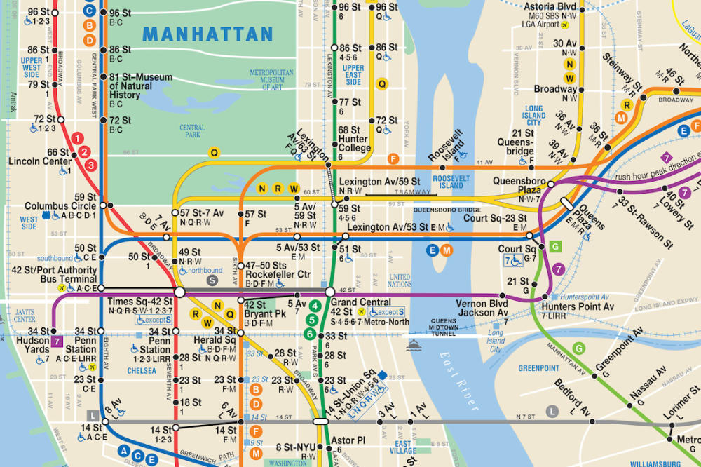
A Modern Take on a Classic Map
The new subway map, displayed on digital screens in stations and rolling out across train cars, prioritizes simplicity. Unlike the previous map, which mirrored the city’s geographic layout with detailed depictions of boroughs and landmarks like Central Park, the redesigned version adopts a diagrammatic approach. Subway lines are straightened, and station names are more prominent, making it easier to trace routes. The MTA collaborated with design firm Work & Co. to create a map that balances functionality with aesthetic appeal.
The redesign draws inspiration from global transit systems, such as London’s iconic Tube map, which favors schematic clarity over geographic accuracy. “Our goal was to make navigation intuitive, especially for first-time riders,” said MTA Chief Customer Officer Shanifah Rieara in a press release. The map retains essential information, like express versus local trains, but reduces visual clutter.
Addressing Rider Needs
With over 3.5 million daily subway riders, New York City’s transit system is one of the busiest in the U.S.. The old map, often called “subway spaghetti” for its tangled lines, was notoriously difficult for tourists and even some locals to decipher. The new design addresses these challenges by enlarging text and using brighter colors to differentiate lines. Accessibility features, such as clearer indicators for ADA-compliant stations, have also been improved.
The MTA conducted extensive rider feedback sessions during the redesign process. Surveys showed that 68% of riders prioritized route clarity over geographic fidelity. The new map also integrates with digital tools, including the MTA’s mobile app, which offers real-time updates and trip planning.
Mixed Reactions from New Yorkers
While many welcome the update, not all feedback has been positive. Some New Yorkers argue the map sacrifices the city’s unique character. “The old map showed you where you were in the city, not just the subway,” said Brooklyn resident Maria Torres, 34. Social media posts on X reflect similar sentiments, with users lamenting the loss of geographic context. Others, like Manhattan commuter James Lee, 27, praise the clarity: “I can finally read it without squinting.”
Design critics have also weighed in. The new map moves away from the 1972 Massimo Vignelli design, which, though controversial, is celebrated for its modernist elegance. Some argue the new version lacks the same artistic flair. However, Work & Co. defends the design, noting that rider usability was the primary focus.
Challenges and Future Plans
The rollout comes amid broader MTA initiatives to modernize the subway system. Governor Kathy Hochul’s 2026 budget allocates $69 billion for capital improvements, including new fare gates to replace turnstiles and the expansion of the Second Avenue Subway. The map’s release aligns with the planned Q4 2025 launch of mobile OMNY transit cards for Apple Wallet, further streamlining the rider experience.
However, fare evasion and safety concerns persist. While transit crime dropped 10% in 2025 compared to 2024, recent incidents, including a fatal stabbing at Brooklyn Bridge-City Hall station, have heightened scrutiny. The MTA hopes the new map will boost rider confidence by making the system feel more accessible and navigable.
The MTA plans to gather feedback on the map through 2025, with potential tweaks based on rider input. Physical maps will be available at stations by summer, and digital versions are already accessible online.
New York City MTA Unveils New Subway Map for the Five Boroughs (May 8, 2025)
#NYCSubway #SubwayMap #MTARedesign #NewYorkCity #Transit
Tags: subway map, New York City, MTA, transit, redesign, navigation, urban planning
Social Media Blurbs
X Blurb (20-25 words)
NYC Unveils New Subway Map: First redesign in decades simplifies navigation. Explore the changes! #NYCSubway #MTARedesign bit.ly/nycsubwaymap
Bluesky Blurb (25-30 words)
NYC’s new subway map is here! Cleaner lines, easier navigation, but some miss the old vibe. Check it out and share your take. #NYCSubway #MTARedesign bit.ly/nycsubwaymap
LinkedIn Blurb (75-100 words)
NYC Unveils New Subway Map, the first redesign since 1979, streamlining navigation for 3.5 million daily riders. The MTA’s modernized design enhances usability, aligning with initiatives like mobile OMNY cards and fare gate upgrades. This overhaul reflects urban planning’s focus on accessibility and efficiency, impacting commuters and businesses reliant on transit. While some praise the clarity, others debate the loss of geographic context. Explore the changes at stewardshipreport.org. #NYCSubway #MTARedesign #UrbanPlanning
Truth Social Blurb (40-50 words)
NYC Unveils New Subway Map: First redesign in decades simplifies navigation for millions. The MTA’s new design sparks debate over clarity versus character. See it at stewardshipreport.org. #NYCSubway #MTARedesign
Mastodon Blurb (50-60 words)
NYC’s subway map got a major redesign, the first since 1979! Cleaner lines and larger text aim to help 3.5 million riders navigate. Some love it, others miss the old map’s geography. Check it out and join the community discussion on the changes. NYC Unveils New Subway Map. #NYCSubway #MTARedesign stewardshipreport.org
Instagram Blurb (30-40 words)
NYC Unveils New Subway Map! Cleaner, simpler, but is it better? See the redesign and share your thoughts. Link in bio.
#NYCSubway #MTARedesign #NewYorkCity #Transit #UrbanDesign
Facebook Blurb (60-75 words)
NYC’s subway map is reborn! The MTA’s first redesign since 1979 simplifies navigation for 3.5 million riders with clearer lines and text. Some love the update, others miss the old map’s charm. Explore the changes and share your thoughts on this transit milestone. NYC Unveils New Subway Map. #NYCSubway #MTARedesign stewardshipreport.org
Reddit Blurb (75-100 words)
NYC Unveils New Subway Map, the first redesign since 1979, aiming to simplify navigation for 3.5 million daily riders. The MTA’s new design emphasizes clarity but drops geographic detail, sparking debate. Some praise the usability; others miss the old map’s context. How do you think the new map impacts your subway experience? Share your thoughts! #NYCSubway #MTARedesign stewardshipreport.org